Not all dark modes are created equal.
In developer and security tools, your dark UI needs to be more than just a theme — it needs to feel like home.
Here's how we build it:
Soft gradients instead of flat black
Low-contrast shadows for depth without harshness
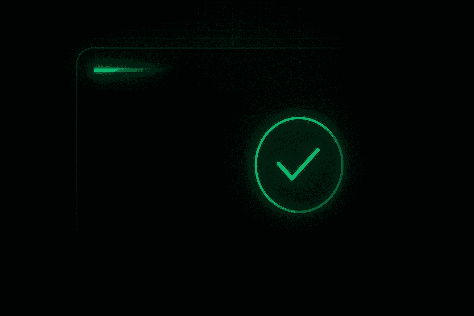
Vaultic green as the only accent to reinforce consistency
Typography hierarchy using system mono fonts
Avoid the common traps:
Don’t overuse neon
Don’t mix too many font sizes
Don’t forget hover states and transitions
A good dark UI whispers security. Vaultic’s UI? It confirms it.

